
.jpg)

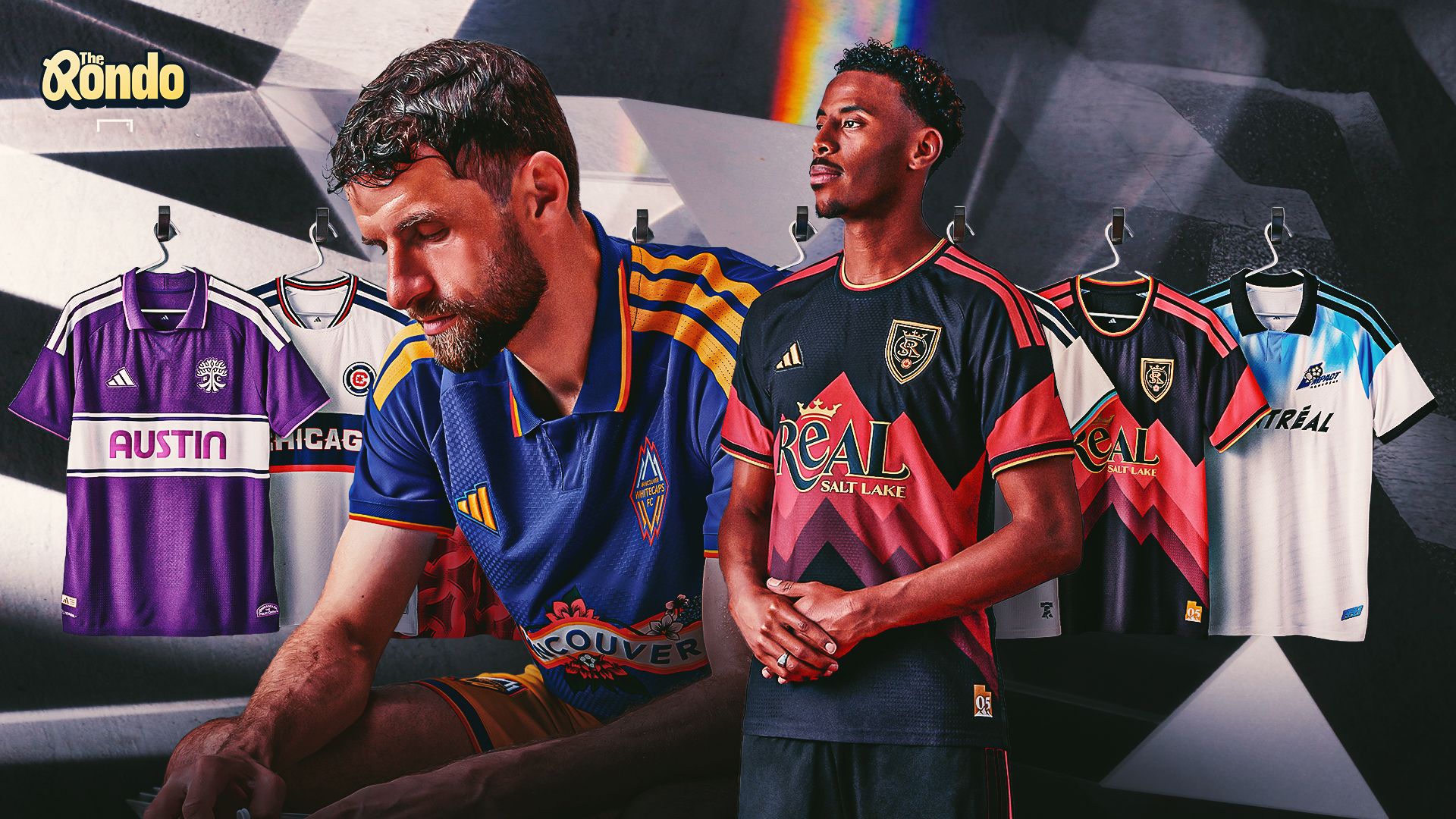
The latest MLS kit drop has landed, sparking a passionate debate among fans and experts alike. While some clubs unveiled truly standout designs, others missed the mark, leaving many to wonder if the league's approach to jersey design is becoming a bit... stale.
Key Takeaways from the New MLS Kit Collection
- Real Salt Lake emerged as the clear favourite, thanks to its bold 1990s-inspired design.
- Philadelphia Union impressed with a distinctive snake crest and nostalgic details.
- Austin FC drew criticism for abandoning its signature green in favour of a violet design.
- Chicago Fire was widely panned for looking too similar to a standard MLS jersey.
MLS Throws It Back With Eight New Third Kits
When it comes to MLS jerseys, third kits have become the place where clubs can break away from the usual formula. With Adidas producing kits across the league, home and away designs can sometimes feel predictable, making the third jersey an opportunity to take more creative risks.
This year's Archive Collection leans heavily into nostalgia, with eight clubs receiving their first-ever throwback-inspired third kits. The selection includes newer clubs such as Austin FC, while Montreal and Vancouver dig deeper into their pre-MLS histories. The results, however, are decidedly mixed.
Real Salt Lake Leads the Throwback Rankings
Among the collection, Real Salt Lake appears to be the overwhelming favourite. Its distinctly 1990s-inspired design connects strongly with the club's identity and the city itself, while the oversized “REAL” lettering gives the jersey an unmistakably retro feel.
The Philadelphia Union also earned plenty of praise. Its snake crest stands out, while the chest branding strikes a balance between nostalgic charm and modern appeal.
Vancouver was another strong contender, finishing just behind RSL for some of the writers. The design successfully taps into the club's history without feeling completely dated.
Austin and Chicago Miss the Mark
Not every throwback experiment worked. Austin FC received the harshest criticism, with the violet colourway standing out as a major issue. Given the club's strong association with green, the departure from its established identity was seen as difficult to justify, even with the explanation that the colours were inspired by Austin's iconic sunsets.
Chicago Fire also struggled to impress. The kit was criticised for looking too similar to jerseys the club has already worn, with the “CHICAGO” lettering replacing a traditional sponsor-style design failing to provide enough of a special-edition feel.
Houston was another design that failed to generate much excitement, with its release described as underwhelming compared with the stronger retro offerings.
Which Kits Could Become MLS Classics?
While Real Salt Lake and Montreal appear to have the strongest chance of developing a cult following, the overall collection falls short of producing an instant MLS classic.
Vancouver also deserves consideration, particularly for its ability to combine retro elements with a design that remains wearable today. However, much of the collection feels more solid than spectacular.
For now, Real Salt Lake sits comfortably at the top of the 2026 MLS throwback kit rankings, while Austin and Chicago find themselves on the opposite end of the fashion table.




.png)