
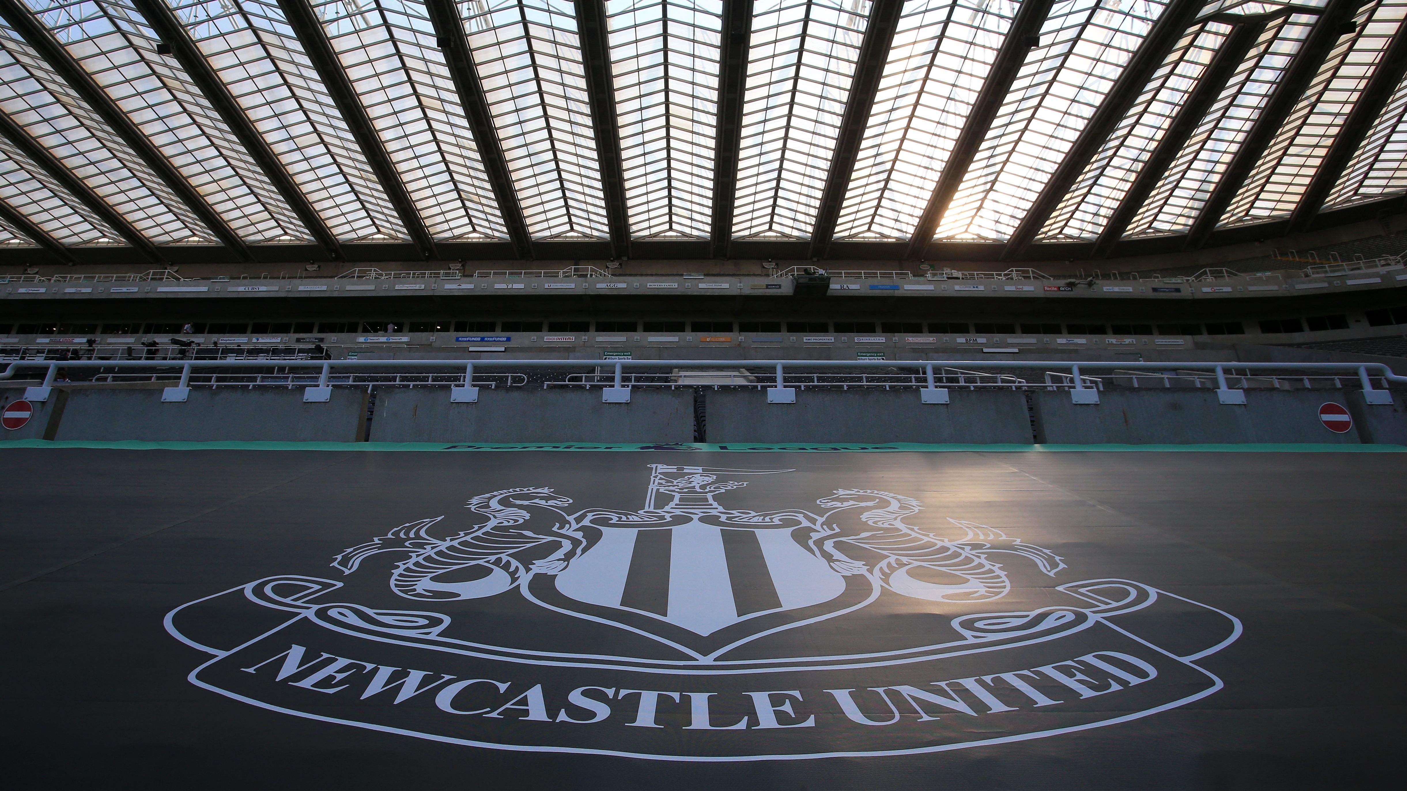

A club's crest is more than just a logo; it's the very soul emblazoned on a shirt, and Newcastle United has just unveiled a stunning evolution that respects its deep roots while signaling a bold future. This isn't merely an update; it's a statement forged by the fans, for the fans, setting the stage for an ambitious era at St. James' Park.
- Newcastle United modernized its club crest after an extensive two-year fan consultation process.
- Over 27,000 supporters voted to approve the new design, which sharpens historic elements like the castle and hippocampi.
- The updated emblem will debut on players' shirts for the season's final home game against Crystal Palace.
- The permanent rollout on kits aligns with the Magpies' ambitious target to challenge for the Premier League title by 2030.
The Fan's Verdict: A Crest Reimagined for the Toon Army
Newcastle United has officially introduced its refined visual identity, a culmination of a meticulous two-year design journey. This significant update wasn't a top-down decision; it was forged through the voices of over 27,000 loyal supporters who cast their votes, ensuring the new emblem resonates deeply with the Toon Army.
The modernized crest pays homage to the club's profound heritage, enhancing familiar elements. The iconic St. James' Park castle, the classic black-and-white striped shield, and the mythological hippocampi – symbols of the city's rich shipbuilding legacy – have all been expertly sharpened. Fans will get their first glimpse of the new badge on matchday shirts when Newcastle hosts Crystal Palace in their final home fixture of the current season.
Honoring the Toon's Deep Civic Roots
Newcastle CEO David Hopkinson underscored the fan-first approach that guided the entire modernization project. He affirmed that the club rigorously adhered to the boundaries and desires articulated by match-going fans from the initial stages. “I have never worked anywhere that feels as proud and passionate about its crest than the way this club does,” Hopkinson stated, highlighting the immense responsibility involved.
Supporters were clear: “protect what we have, keep the elements we love, and do not start again.” Every subsequent design decision respected these directives. Hopkinson emphasized the emblem’s origin in the city’s own coat of arms, asserting it honors the past, represents the present, and will become an enduring symbol for future generations globally.
Behind the Badge: A Lifelong Fan's Meticulous Mission
The intricate redesign of the St. James' Park emblem was a passion project led by Kenneth McIver, the club's chief creative officer and a devoted lifelong Magpies supporter. For McIver, a former Nike designer, this wasn't just another assignment; it was deeply personal.
“As a lifelong fan, our crest was the thing I covered my schoolbooks in,” McIver recounted. He confessed that despite a career spanning major design projects in world football, none carried the intense pressure of shaping the future of his beloved club's identity.
Precision in Every Pixel for Lasting Impact
McIver openly shared the relentless scrutiny from his inner circle, including family and friends in the stands, who showed “no mercy for two solid years.” This constant pressure ensured every aesthetic modification was painstakingly considered. “Nothing has been changed simply because it could be,” he affirmed, emphasizing the fan’s consistent message to preserve core identity.
The result is a crest crafted with profound respect for heritage and identity, yet aligned with the club's forward-looking vision. Every line has been drawn, redrawn, and tested across countless formats, ensuring it performs flawlessly and continues to inspire the Toon Army for decades.
Ambition On and Off the Pitch: The Road to 2030
The new emblem won't just adorn the shirts; it signifies a broader strategic vision. Newcastle is immediately implementing the modernised crest across digital platforms, with its full permanent introduction on playing kits slated for the 2027-28 season. This timeline isn't arbitrary.
It strategically coincides with ambitious boardroom targets aiming to transform the Magpies into serious Premier League title challengers by 2030. While the visual identity evolves, manager Matthias Jaissle recognizes that establishing relentless consistency on the pitch across all competitions remains paramount to translating these grand off-pitch developments into actual silverware.